

Now Reading: Format Sessions & Confirmation Message On Event Registration Form
-
01
Format Sessions & Confirmation Message On Event Registration Form

Have you seen the latest Default registration form with Sessions? It’s great that people can pick and choose which sessions to register for, giving them the freedom to pick and choose where to spend their time at your event. However, the way your form looks is important, and out of the box it might not be exactly what you are looking for. In this post we will look at how you to can use CSS changes to format sessions and the confirmation message to make it look a whole lot nicer.
This is what the form looks like out of the box. We’ve got the sessions at the top, then the registration fields at the bottom. All a bit bland right now.
This is what we can work towards. Something a bit prettier with information about the event first pulling from the Event Description, then the sessions on the left and the form fields on the right. This is a much nicer look and feel.

First of all, we can start off with a new form either by creating directly from an event, or finding the default registration form with sessions and doing a save as. You’ll want an empty section at the top (remove all the stuff in the default one with all the About info). Add in a text block, then click on the personalisation icon and add in the AboutEventDescription. Of course you can put anything else in you want, but for my purpose I just went with this.

Next we need a 2 column section. Add in the Sessions element (all the way at the bottom of the Elements panel) on the left. Then start adding in the fields to your right column. Make sure you add a submit button at the bottom of that column too so the form can be submitted.

Once you’ve built the form, now for the CSS. This part is entirely up to you and based on your own branding and preferences. You’ll need to add in to the style section in the HTML.
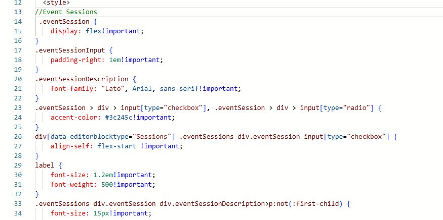
Here are the style classes I added in to format how the Sessions section looked. This places the tick boxes for the sessions on the left at the top, and also makes the background of the box a purple colour when selected. I’ve also got each session in a box with a different colour background and a dotted line border of the same colour.
//Event Sessions
 .eventSession {
    display: flex!important;
}
.eventSessionInput {
    padding-right: 1em!important;
}
.eventSessionDescription {
    font-family: "Lato", Arial, sans-serif!important;
}
.eventSession > div > input[type="checkbox"], .eventSession > div > input[type="radio"] {
    accent-color: #3c245c!important;
}
div[data-editorblocktype="Sessions"] .eventSessions div.eventSession input[type="checkbox"] {
    align-self: flex-start !important;
}
label {
    font-size: 1.2em!important;
    font-weight: 500!important;
}
.eventSessions div.eventSession div.eventSessionDescription>p:not(:first-child) {
    font-size: 15px!important;
    margin-top: 4px!important;
    line-height: 1.5!important;
}
.eventSessions div.eventSession div label, .eventSessions div.eventSession div label div {
    font-family: "Lato", Arial, sans-serif;
    font-size: 15px!important;
    font-weight: bold!important;
    color: #3c245c!important;
}
div[data-editorblocktype="Sessions"] h2 {
    display: none!important;
}
div[data-editorblocktype="Sessions"] .eventSessions div.eventSession {
    display: flex !important;
    align-items: flex-start !important;
    justify-content: flex-start !important;
    gap: 4px !important;
    margin-bottom: 16px;
    padding: 1em;
    background: #f3f3f3;
    border: 1px dotted #3c245c;
}
On your form settings, you have the option to redirect someone after they submit the form, or add a thank you message. I would suggest leaving the thank you message as the person also gets a quick visual confirmation of the sessions they registered for. As with the form, it doesn’t look that great but we can add in some more CSS to customise that too.

Some of the CSS we added earlier will also be used on the confirmation screen but we can add in some extra bits and pieces. The style classes below are going to hide the green tick icon that shows, and hide the Registered text. Instead, we are styling the message the thank you notification message that was added to the form to make it bigger and change the colour. The styling for the box around each session is the same as for the main form so if you change it here, it will be changed on the form too.
//Event Registration Confirmation
div[data-cached-form-url] .sessionInformationTitle {
    display: none!important;
    color: rgba(255, 255, 255, 0.25);
}
div[data-cached-form-url] .onFormSubmittedFeedback {
    align-items: flex-start;
}
div[data-cached-form-url] .onFormSubmittedFeedbackIcon {
    display: none;
}
div[data-cached-form-url] .onFormSubmittedFeedback .onFormSubmittedFeedbackMessage {
    color: #3c245c;
    font-size: 1.4em;
    font-weight: bold;
}
div[data-cached-form-url] .onFormSubmittedFeedback .onFormSubmittedFeedbackInternalContainer {
    padding: 4em 0 0 0;
}
h3.sessionInformationTitle {
    display: none !important;
}
Now when the form is submitted, you get this lovely confirmation instead of the original out of the box one. Loads better!

Original Post http://meganvwalker.com/format-sessions-confirmation-message-registration/


