

Now Reading: Where Can You Find Analytics In Customer Insights Journeys?
-
01
Where Can You Find Analytics In Customer Insights Journeys?

You carefully craft your marketing campaigns, put together your amazing emails and set up your journeys in Customer Insights. Then off they go! Now to review some analytics. But where do you find them, and how can you know you are looking at the right information? Well…. there are a LOT of places you can do that. Let’s take a look at where you can find analytics in Customer Insights Journeys on your marketing efforts.
Analytics Section
First off, we have the Analytics section in the Realtime area. There are currently two reports that are essentially Power BI reports embedded in to the marketing app. You’ve got the Journey analytics and Channel analytics. Personally, these don’t really do much for me and I’ve typically found that they are not of much interest or value to my clients. Instead, if you want to have truly custom reporting, I would suggest working with someone to get some nice reports written using the Fabric integration. You can find out more here.

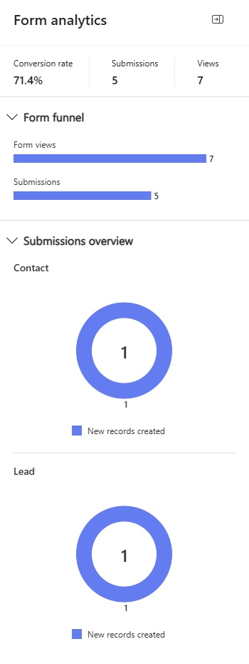
Form Analytics
Marketing forms have their own analytics. Once your form is live you’ll see number of Views and Submissions, with a calculated Conversion Rate using the two. You can also see the number of new records created for Leads and Contacts (depending on the form rules you’ve set up as to what will be created).
Email Insights
Email insights can be seen as an overview from within a Journey (more on that in a moment), but the real detail and interest can be found from the Insights tab on each email itself. You can review for all Journeys, or filter (if you’ve used it in more than 1 Journey) to get a break down that way. From here we get delivery information, interactions (open, clicks, etc.), engagement trends, link insights, information about email clients and browsers used, and a lovely click map (make sure you have the feature switch turned on for this!). A lot of these sections have a View details link which when clicked on will take you to even more information and analytics.

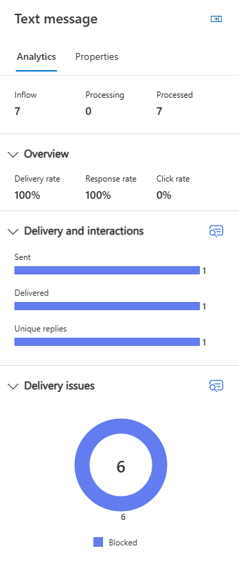
Test Message Report
Sorry about the crappy screenshot, but I don’t have much data for text messages to show! However, on each Text Message you can click on the Reports tab, and again we get an embedded Power BI report. All it seems to have the ability to show you are delivery trends with numbers of Sent, Delivered and Clicked text messages.

Journey Analytics
With this one, we can get top level Journey analytics, then for different types of tiles we can see further analytics specific to that particular action. Let’s go through some of these so you can see what is available. For each of the analytics sections, if you see a blue icon with a magnifying glass, you can click on it to see the detail behind the values.
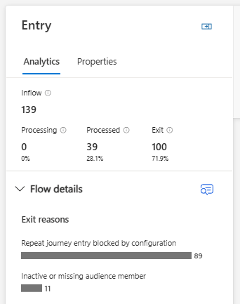
Journey Overview Analytics
The very top tile is for people entering your Journey (either from a segment or via a trigger). Some of the information you see on this screenshot might not be on all of your journeys as showing the flow details is relatively new. However, you should at least see how many are inflow (have entered the Journey) along with how many are processing, have processed and/or exited. Below that, you will see reasons that people have exited the Journey. This is more likely to happen with triggers where someone met the criteria for someone to fire the trigger, but the Journey itself had conditions on it so that only specific people or circumstances would allow the customer to continue on to the next step.
Attribute Branch Analytics
If you have an attribute branch, the analytics here will show how many inflow (have entered) then how many are processing and processed. Again, exit data may or may not show depending on how recent the journey is and if you’ve been using that feature yet. You can then get an overview of how many went down each branch you have on the Journey.

Email Analytics
All of the information here can be seen (with the extra detail) directly from the Email itself. However, this gives you a quick glance high level overview with information about any delivery issues, how many were sent, delivered and opened and gives you delivery, open and click rates.

Text Analytics
Similar to the Email overview, you can see any delivery issues along with the number of sent, delivered and unique replies. You’ll also see delivery rate, response rate and click rate.
Wait Analytics
If you’ve added a wait step in your journey, that will also have analytics. Here we can see how many have entered in to this step along with the number that were processed (passed through the wait) and the number that exited (were removed from the journey at this point). We will also see the reason they exited too.

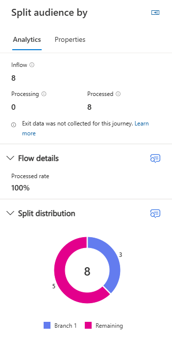
Split Audience Analytics
If you use the option to split your Journey audience, the analytics here will let you know how many have entered this step, are still processing or have been processed. You’ll also see the numbers of how the split was distributed.
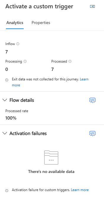
Activate Custom Trigger Analytics
If you activate a custom trigger from within the journey, this also gets it’s own analytics. This will also show the number inflow that have entered this step, the number still being processed and the number that have been processed. You’ll also get information if there are any failures within this step.
Anywhere else you can think of that I missed? Let me know in the comments!
Original Post http://meganvwalker.com/find-analytics-in-customer-insights-journeys/


