Now Reading: Webinar: Master CRM with Mind Maps and Kanban Boards: Smart Visualization Techniques for Dynamics 365!
-
01
Webinar: Master CRM with Mind Maps and Kanban Boards: Smart Visualization Techniques for Dynamics 365!
Webinar: Master CRM with Mind Maps and Kanban Boards: Smart Visualization Techniques for Dynamics 365!

 Understanding complex Dynamics 365 CRM data can feel like navigating through a tangled web. With intricate relationships between records and a multitude of customer data, it’s easy to get lost in the details. To make it easier, we need ways to simplify it. We need clear visuals that show what’s important and how each record is related.
This is where data visualization tools come in. They help turn confusing data into something easy to understand, so you can make better data-based decisions.
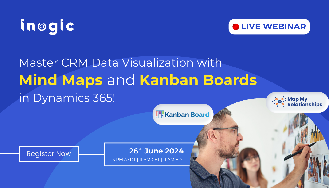
Here is your opportunity to explore Kanban Board and Map My Relationships apps. Two popular Dynamics 365 CRM data visualization tools by Inogic.
Join our upcoming webinar to experience how these apps can help you simplify CRM data by visualizing it in Kanban and Mind Map Views.
Master CRM Data Visualization with Mind Maps and Kanban Boards in Dynamics 365!

Wednesday 26th June 2024
3PM AEDT, 11AM CET and 11AM EDT
Key Highlights of the Webinar:
Kanban Board
With Kanban Board app you can visualize…