Now Reading: Prevent Duplicate Icons in the Focused View of the Side Pane in Dynamics 365 CRM
-
01
Prevent Duplicate Icons in the Focused View of the Side Pane in Dynamics 365 CRM
Prevent Duplicate Icons in the Focused View of the Side Pane in Dynamics 365 CRM

Recently while working on adding a sidepane dynamically using code on my custom model-driven app, I encountered an issue that led to a double icon display when I clicked on the “Focussed View” button, which caused the UI to become cluttered and messy. In this blog, I’ll walk you through the issue I faced, the solution I discovered, and the outcome of this approach. To know more about how to add or create a sidepane you can follow this link.
I was working on customizing the sidepane in my model-driven app, where the icon appears based on certain conditions when the page loads. But I noticed an unexpected behaviour while testing the functionality.
Every time I clicked on the focussed view button (which switches the view of records in D365), the sidepane was displaying the same icon again as per the below screenshot.
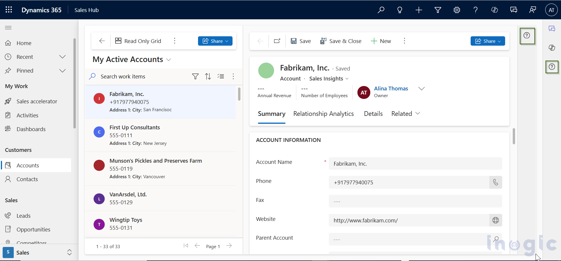
Essentially, it was creating a duplicate icon on the screen, causing the UI to look cluttered. The issue was that the code I was using to load the sidepane icon…